Fan Card
The Fan Card is a modified light card turning on and off your fan entity. It also provides a toggle for turning on and off the oscillation of the fan.
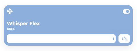


Usage
📄 /templates/custom_card_fan/custom_card_fan.yaml
type: "custom:button-card"
entity: fan.whisper_flex
template:
  - custom_card_fan
Template
/dashboard/HaCasa/templates/custom_card_fan/custom_card_fan.yaml
custom_card_fan:
  show_name: true
  show_icon: true
  show_label: true
  show_state: false
  label: |
    [[[
      if (entity.state == 'on') {
        return states[entity.entity_id].attributes.percentage + "%"
      } else {
        return 'Off'
      }
    ]]]
  styles:
    grid:
      - grid-template-areas: |
          'i switch'
          'n n'
          'l l'
          'slider osc_icon'
      - grid-template-rows: 3rem 1fr min-content min-content
      - grid-template-columns: 1fr min-content
      - row-gap: 3px
    card:
      - padding: 10px
    img_cell:
      - justify-self: start
      - align-self: start
      - width: 20px
      - height: 20px
      - overflow: visible
    icon:
      - justify-self: start
      - align-self: start
      - width: 20px
      - height: 20px
      - overflow: visible
    name:
      - text-align: left
      - font-size: var(--fs-400)
      - font-family: Montserrat
      - font-weight: 700
      - justify-self: start
      - align-self: end
      - overflow: visible
      - font-size: 1.2rem
    label:
      - text-align: left
      - font-size: var(--fs-300)
      - font-family: Montserrat
      - font-weight: 500
      - justify-self: start
      - align-self: center
      - color: var(--color-dark-gray)
      - overflow: visible
      - padding-bottom: 10px
    custom_fields:
      switch:
        - width: 25px
        - justify-self: end
        - align-self: start
        - color: var(--color-dark-gray)
        - margin-top: -4px
      osc_icon:
        - justify-self: end
  state:
    - value: 'off'
      icon: fapro:fan
      styles:
        custom_fields:
          switch:
            - color: var(--color-light-gray-nav)
            - transform: rotate(180deg)
    - value: 'on'
      icon: fapro:fan-fill
      styles:
        card:
          - background: var(--color-blue)
        name:
          - color: var(--color-white)
        label:
          - color: var(--color-white)
        icon:
          - color: var(--color-white)
        custom_fields:
          switch:
            - color: var(--color-white)
      custom_fields:
        slider:
          card:
            type: custom:my-slider-v2
            entity: '[[[ return entity.entity_id ]]]'
            styles:
              card:
                - height: 30px
              container:
                - border-radius: 8px
              progress:
                - height: 100%
                - background: white
              track:
                - background: '#eeeeee'
              thumb:
                - height: 30%
                - background: var(--color-blue)
                - position: absolute
                - right: 7px
                - top: 11px
                - width: 3px
                - border-radius: 500px
        osc_icon:
          card:
            type: custom:button-card
            icon: |
              [[[
                if (entity.attributes.oscillating == 'false') {
                  return 'mdi:arrow-oscillating-off'
                } else {
                  return 'mdi:arrow-oscillating'
                }
              ]]]
            styles:
              card:
                - width: 40px
                - border-radius: 8px
                - height: 30px
                - margin-left: 10px
                - background: white
              icon:
                - width: 20px
                - color: var(--color-blue)
            tap_action:
              action: call-service
              service: fan.oscillate
              service_data:
                entity_id: '[[[ return entity.entity_id ]]]'
                oscillating: |
                  [[[
                    if (entity.attributes.oscillating == 'false') {
                      return 'true'
                    } else {
                      return 'false'
                    }
                  ]]]
    - value: unavailable
      name: 'Unavailable'
      styles:
        icon:
          - color: var(--color-dark-gray)
  custom_fields:
    switch: |
      [[[
        if (entity.state == "on"){
          return '<ha-icon icon="fapro:toggle-on"></ha-icon>';
        } else if (entity.state == "unavailable") {
          return '<ha-icon icon="fapro:toggle-off"></ha-icon>';
        } else {
          return '<ha-icon icon="fapro:toggle-on"></ha-icon>';
        }
      ]]]
  hold_action:
    action: more-info