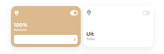
Light Card
The light-card, used for a light entity, displays the current state and brightness (if available). Its uses a slider where you can set the brightness with. It hides the slider if the state is off.

Usage
/templates/custom_card_light/custom_card_light.yaml
type: "custom:button-card"
entity: light.bedroom
label: Bedroom
template:
  - custom_card_light
Template
/dashboard/HaCasa/templates/custom_card_light/custom_card_light.yaml
---
custom_card_light:
  entity: "[[[ return entity.entity_id ]]]"
  name: |
      [[[
        var bri = (Math.round(states[entity.entity_id].attributes.brightness / 2.55));
        return ' ' + (bri ? bri + '%': 'Uit');
      ]]]
  show_name: true
  show_icon: true
  show_label: true
  show_state: false
  styles:
    grid:
      - grid-template-areas: |
          'i switch'
          'n n'
          'l l'
          'slider slider'
      - grid-template-rows: 3rem 1fr min-content min-content
      - grid-template-columns: 1fr 1fr
    card:
      - height: 100%
      - padding: 10px
    img_cell:
      - justify-self: start
      - align-self: start
      - width: 20px
      - height: 20px
      - overflow: visible
    icon:
      - justify-self: start
      - align-self: start
      - width: 18px
      - height: 18px
      - overflow: visible
    name:
      - text-align: left
      - font-size: "var(--fs-400)"
      - font-family: Montserrat
      - font-weight: 700
      - justify-self: start
      - align-self: end
      - overflow: visible
      - font-size: 1.2rem
    label:
      - text-align: left
      - font-size: "var(--fs-300)"
      - font-family: Montserrat
      - font-weight: 500
      - justify-self: start
      - align-self: center
      - color: var(--color-dark-gray)
      - overflow: visible
      - padding-bottom: 10px
    custom_fields:
      switch:
        - width: 25px
        - justify-self: end
        - align-self: start
        - color: var(--color-dark-gray)
        - margin-top: -4px
  state:
    - value: "off"
      icon: fapro:bulb
      styles:
        icon:
          - color: var(--color-dark-gray)
        custom_fields:
          switch:
            - color: var(--color-light-gray-nav)
            - transform: rotate(180deg)
    - value: "on"
      icon: fapro:lightbulb-on
      styles:
        card:
          - background: "var(--color-gold)"
        name:
          - color: "var(--color-white)"
        label:
          - color: "var(--color-white)"
        icon:
          - color: "var(--color-white)"
        custom_fields:
          switch:
            - color: "var(--color-white)"

      custom_fields:
        slider:
          card:
            type: custom:my-slider-v2
            entity: '[[[ return entity.entity_id ]]]'
            styles:
              card:
                - height: 30px
              container:
                - border-radius: 8px
              progress:
                - height: 100%
                - background: white
              track:
                - background: '#EEEEEE'
              thumb:
                - height: 30%
                - background: var(--color-gold)
                - position: absolute
                - right: 7px
                - top: 11px
                - width: 3px
                - border-radius: 500px
    - value: "unavailable"
      name: '?'
      icon: fapro:lightbulb
      styles:
        icon:
          - color: var(--color-dark-gray)
  custom_fields:
    switch: >
      [[[
        if (entity.state == "on"){
          return '<ha-icon icon="fapro:toggle-on"></ha-icon>';
        } else if (entity.state == "unavailable") {
          return '<ha-icon icon="fapro:toggle-off"></ha-icon>';
        } else {
          return '<ha-icon icon="fapro:toggle-on"></ha-icon>';
        }
      ]]]
  hold_action:
    action: more-info